TL;DR — What This Article Covers
Most high-ticket service businesses are making a quiet, costly mistake on their landing pages: hiding their best social proof inside a carousel that 99% of visitors never interact with.
Here's what the research shows — and what to do about it:
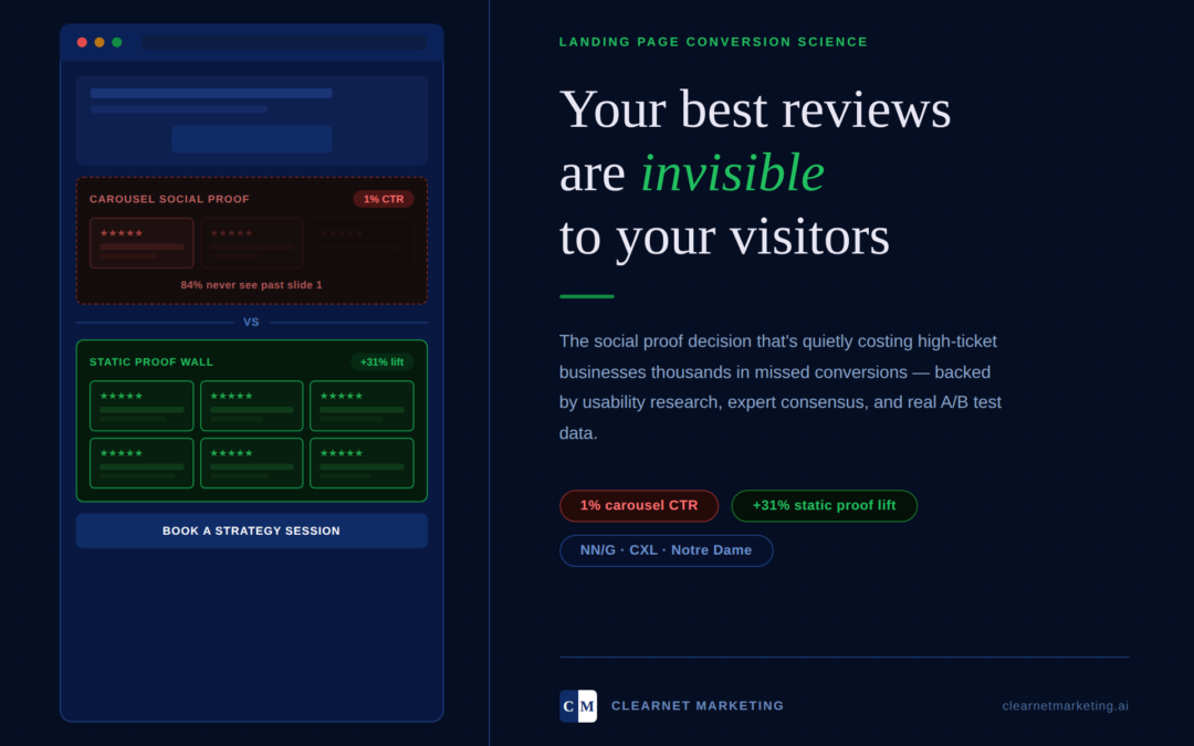
- Carousels kill visibility. Only 1% of visitors click any carousel element. Of that 1%, 84% of clicks land on slide 1. Everything else — your strongest reviews, your most compelling testimonials — is effectively invisible.
- Banner blindness is real. The Nielsen Norman Group found that users filter out rotating content the same way they ignore ads, even when the information is directly relevant to them.
- Static proof converts. Displaying reviews as visible, always-on images produces measurable lifts: +31% when UGC appears near your service description, +12.3% above your CTA, and +11.2% in the hero section — all without requiring a single click from the visitor.
- The fix isn't choosing one or the other. The data supports a hybrid approach: a static proof wall as your primary conversion driver, with an optional manual-control testimonial carousel positioned mid-page as a secondary spotlight — never auto-rotating, never in the hero.
- The bottom line: The instinct to "clean up" your landing page by swapping a proof wall for a carousel is understandable — but expensive. Visible social proof is not a design flaw. It is your highest-impact conversion mechanism.
Read on for the full research breakdown, expert consensus, and a placement blueprint you can hand directly to your web team.
Why the design choice you think looks polished is silently killing your leads
You worked hard to earn those five-star reviews. You asked for them. You waited for them. You screenshot them, uploaded them, and placed them prominently on your landing page.
Then someone said, "That looks cluttered. Have you thought about a carousel?"
And now you're considering it.
Before you make that change — stop. Because the data is unambiguous, the research is settled, and the conversion cost of getting this wrong is substantial.
This is not a design opinion. This is a conversion science conversation. And for high-ticket service businesses — where a single lost lead can mean a $5,000, $15,000, or $50,000 missed opportunity — this decision matters far more than most business owners realize.
The Problem With "Looking Professional"
There's a quiet trap that catches even sophisticated business owners: the belief that clean equals credible.
It's understandable. You've invested in your brand. You want your website to reflect the premium nature of your service. You don't want your landing page looking like a cluttered infomercial.
So when someone suggests a sleek, animated carousel to showcase your testimonials — cycling through one elegant review at a time — it feels like a refinement. More modern. More polished.
Here's what that polish is actually doing to your conversions.
The Research on Carousels Is Not Kind
The Nielsen Norman Group, widely considered the definitive authority on web usability, studied how users interact with rotating content on websites. They gave users specific tasks — answers that were literally displayed on the most prominent carousel slide — and watched what happened.
Users failed to find the information. Not because it wasn't there. Because their brains had already classified the rotating element as advertising and filtered it out.
This is called banner blindness. Carousels trigger it reliably. The conclusion from NN/G: carousels are noticed but ignored.
Notre Dame University ran their own test. The findings were stark. Only 1% of site visitors clicked on any carousel image at all. Of that 1%, a full 84% of clicks landed on the first slide — meaning everything from slide two onward was effectively invisible to 99% of visitors.
Let that land for a moment.
You could have six glowing reviews cycling through your carousel. The average visitor will see one. Most won't register even that.

Expert Consensus Is Unanimous
This is not a fringe position. Some of the most respected names in conversion rate optimization have reached the same conclusion independently:
Chris Goward of WiderFunnel, after running hundreds of tests: "We have tested rotating offers many times and have found it to be a poor way of presenting homepage content."
Tim Ash of SiteTuners — direct and unambiguous: "Rotating banners are absolutely evil and should be removed immediately."
Peep Laja of CXL, after reviewing thousands of split tests, concluded that almost all sites using image sliders actually lost sales compared to their static alternatives. CXL's official guidance is clear: you shouldn't be using sliders and carousels on your site, and should replace them with static images instead.
Three separate experts. Thousands of tests. One conclusion.

Why Your Static Proof Wall Is Not Cluttered — It's Converting
Here's the reframe that changes everything.
What you call "cluttered," conversion science calls proof stacking — and it is one of the most powerful trust-building strategies available to any high-ticket service business.
The framework, popularized by entrepreneur and investor Alex Hormozi, centers on a single principle: a prospect's decision to buy is driven largely by their perceived likelihood of success. Not your credentials. Not your process. Their belief that this will actually work for them.
And nothing builds that belief faster than volume of visible, authentic social proof.
When a prospect lands on your page and sees multiple reviews, screenshots, and testimonials simultaneously, something powerful happens psychologically: the brain reads credibility as cumulative. One review creates a data point. Six visible reviews create a pattern. A pattern creates conviction.
This is Robert Cialdini's principle of social proof operating at full power — and it only works when the evidence is visible without effort. The moment you hide your proof behind a carousel interaction, you've added a behavioral requirement that most visitors will never fulfill.
What the Placement Data Actually Shows
Research on social proof placement is specific and actionable. When testimonials and reviews are displayed as visible, static content:
- Placing social proof above the inquiry CTA lifts conversions by +12.3%
- Social proof near pricing increases engagement by +9.1%
- Proof in the hero section improves click-through by +11.2%
- User-generated content — real review screenshots, exactly the kind you're using — near your service description increases conversions by +31%
Every one of those gains evaporates if a visitor has to interact with a carousel to see the proof. Because they won't interact with it. The research has confirmed that repeatedly.

The Paradox of One: Why Showing Less Shows Nothing
There is a counterintuitive dynamic at play with testimonial carousels that goes beyond banner blindness.
When a carousel presents one testimonial at a time, the design implies that single review is sufficient — that one voice should be enough to persuade. But high-ticket buyers don't work that way. They are conducting due diligence. They want to triangulate. They want to see multiple different people, in different situations, having the same positive experience.
A static proof wall answers that need instantly. Eyes scan, patterns emerge, trust compounds — all without a single click required.
The carousel, by design, forces sequential consumption of what should be simultaneous evidence. It converts a powerful wall of credibility into a slow drip that most visitors will never wait through.
When Carousels Do Work (And It's Not Your Landing Page)
In fairness, carousels are not universally ineffective. But where they perform, the context is entirely different.
On Instagram and TikTok, carousel posts generate meaningfully higher engagement than static images — sometimes dramatically so. But this is because swipe behavior is native and expected on those platforms. Users are in browse mode. The interaction is intuitive.
On a landing page, visitors are in evaluation mode. They arrived with a specific question: Should I trust this person enough to give them my money? They are not browsing. They are deciding. The psychology is completely different, and the tools that serve browsers actively harm deciders.
There is one exception worth noting: a manually controlled testimonial carousel positioned mid-page — not as a hero element, not auto-rotating, limited to five entries maximum — can perform well as a complement to existing social proof. One case study showed a 34% conversion lift in testimonials displayed this way, paired with a 247% increase in testimonial interaction.
The critical distinctions: manual control only (auto-rotation triggers banner blindness), positioned mid-page rather than in the hero section, and presented in addition to a visible proof wall — not as a replacement for it.

The Decision Framework for High-Ticket Service Businesses
If you operate a medical practice, law firm, real estate agency, home services company, or any business where a single client relationship is worth thousands of dollars, here is the framework:
Your landing page has one job. Get the prospect to take the next step — book a consultation, request a quote, schedule a call. Every design decision should be evaluated against that singular goal.
Your social proof has one job. Make the prospect feel confident enough that your service will deliver results. That confidence is built through volume, visibility, and authenticity.
A static proof wall — multiple real reviews displayed simultaneously, visible without interaction — serves both of those jobs simultaneously. It builds trust in real-time and moves visitors toward your CTA without asking them to do anything.
A hero carousel asks visitors to wait, click, or interact before they've been given a reason to care. Most won't. The opportunity disappears.
What to Do Instead: The Hybrid Strategy
If aesthetics are a genuine concern — if you want the page to feel polished without sacrificing conversion performance — here is the approach the research supports:
Keep your static proof wall as the primary social proof display. This is the conversion workhorse. It stays visible. It builds cumulative trust. It requires nothing from the visitor.
Add a secondary testimonial spotlight below — a manually controlled, mid-page carousel featuring three to five of your most specific, results-oriented reviews. This satisfies the desire for a cleaner featured display while preserving the proof wall above.
Never auto-rotate. Auto-rotation is the specific mechanism that triggers banner blindness and actively frustrates users. Manual control only.
Optimize the proof wall for scannability. The goal isn't wall-to-wall text — it's enough visible credibility that a prospect can scan and see a clear pattern of trust. Star ratings, recognizable review platform branding, and authentic-looking screenshots perform especially well.

The Bottom Line
The instinct to make your landing page look more refined is understandable. But when that instinct leads you to hide the evidence that makes high-ticket buyers convert, it becomes expensive.
Static social proof is not a design flaw. It is a conversion mechanism — backed by usability research, expert consensus, and A/B test data across thousands of landing pages.
The prospects arriving at your page are sophisticated. They are not going to be impressed by an elegant slider. They are going to be persuaded by a pattern of evidence that confirms what you are telling them in your headline.
Give them that evidence. Make it visible. Let them see all of it at once.
Your carousel can wait. Your conversions cannot.
Ready to find out what your current landing page is actually costing you? Book a private AI audit with Clearnet Marketing — we'll identify exactly where your highest-value prospects are falling off, and what it would take to bring them back.